House 2 Home
Project Overview
This project was done as a GV Design Sprint.
House2Home is a company that sells accent pieces and house accessories to complete a home’s look, focusing mainly on people who have recently moved and want to quickly start decorating.
Challenge
House2Home would like to introduce a “starter kit”, which would help customers have a few items to immediately begin filling up their home.
Solution
I created a dedicated page to starter kits, allowing customers to choose their own already-curated starter kit based on certain aesthetics. The page includes a view of all four items in a living space and offers a discount to the customers when bought together.
Role
Lead UX Designer
Timeline
5 days
Tools
Keynote & Figma
![](https://static.wixstatic.com/media/a8c4ba_67b928028b1042ff931b44c67df423cb~mv2.png/v1/fill/w_491,h_472,al_c,q_85,usm_0.66_1.00_0.01,enc_avif,quality_auto/a8c4ba_67b928028b1042ff931b44c67df423cb~mv2.png)
![Group 74.png](https://static.wixstatic.com/media/a8c4ba_9379154f49ad4ae7a9a57692af5f88f0~mv2.png/v1/fill/w_1339,h_68,al_c,q_85,usm_0.66_1.00_0.01,enc_avif,quality_auto/Group%2074.png)
![Group 75.png](https://static.wixstatic.com/media/a8c4ba_73cb9b74f5f9486d96572c564f90c709~mv2.png/v1/fill/w_266,h_82,al_c,q_85,usm_0.66_1.00_0.01,enc_avif,quality_auto/Group%2075.png)
I picked out the main pain points that the shoppers were struggling with when they tried to buy accent pieces online.
![Group 70.png](https://static.wixstatic.com/media/a8c4ba_6d5163cdb5d34175aa167f6c769890ad~mv2.png/v1/fill/w_673,h_268,al_c,q_85,usm_0.66_1.00_0.01,enc_avif,quality_auto/Group%2070.png)
With these four main points in mind, I deliberated on several end-to-end user flows, selecting one that allows the user to choose a theme for their kit. After that, the flow follows the general shopping layout, having the user add to cart and go through the checkout process.
![Group 76.png](https://static.wixstatic.com/media/a8c4ba_36345354674043768c5c72e84b468ad4~mv2.png/v1/fill/w_773,h_58,al_c,q_85,usm_0.66_1.00_0.01,enc_avif,quality_auto/Group%2076.png)
![Group 58.png](https://static.wixstatic.com/media/a8c4ba_b9880329ed1b453894cdb399ad25e280~mv2.png/v1/fill/w_442,h_100,al_c,q_85,usm_0.66_1.00_0.01,enc_avif,quality_auto/Group%2058.png)
![Group 74.png](https://static.wixstatic.com/media/a8c4ba_9379154f49ad4ae7a9a57692af5f88f0~mv2.png/v1/fill/w_1339,h_68,al_c,q_85,usm_0.66_1.00_0.01,enc_avif,quality_auto/Group%2074.png)
![Group 77.png](https://static.wixstatic.com/media/a8c4ba_156e8728e2ad46409b323e785462d43f~mv2.png/v1/fill/w_284,h_82,al_c,q_85,usm_0.66_1.00_0.01,enc_avif,quality_auto/Group%2077.png)
I started off with research with other online shopping sites that sold kits or accent pieces, such as Etsy, Accent Decor, and Wayfair. With furniture and decorative items, it seems important to show how they fit in a bigger setting, not only having a close up of the piece.
![Group 26.png](https://static.wixstatic.com/media/a8c4ba_0904066245454598823dbd479297d34f~mv2.png/v1/fill/w_762,h_332,al_c,q_85,usm_0.66_1.00_0.01,enc_avif,quality_auto/Group%2026.png)
Since H2H wants to focus on a starter kit for customers to get multiple products to start decorating, I believe one of the most critical screens would be the product page of the kit. Taking ideas from other websites, I wanted to have a design where customers could see all the items working together to create a theme.
![Group 28.png](https://static.wixstatic.com/media/a8c4ba_0c12288dc5124561ae25bab62d6ef8bc~mv2.png/v1/fill/w_770,h_225,al_c,q_85,usm_0.66_1.00_0.01,enc_avif,quality_auto/Group%2028.png)
![Group 59.png](https://static.wixstatic.com/media/a8c4ba_83b1ef8ddd9e4c468593459160efbd32~mv2.png/v1/fill/w_442,h_100,al_c,q_85,usm_0.66_1.00_0.01,enc_avif,quality_auto/Group%2059.png)
![Group 74.png](https://static.wixstatic.com/media/a8c4ba_9379154f49ad4ae7a9a57692af5f88f0~mv2.png/v1/fill/w_1339,h_68,al_c,q_85,usm_0.66_1.00_0.01,enc_avif,quality_auto/Group%2074.png)
![Group 78.png](https://static.wixstatic.com/media/a8c4ba_574db05eac5540549945c3188cd64a33~mv2.png/v1/fill/w_266,h_82,al_c,q_85,usm_0.66_1.00_0.01,enc_avif,quality_auto/Group%2078.png)
When creating my storyboard, I thought about my previous experiences with online shopping, recalling different possible layouts for the homepage and the checkouts.
![Screenshot 2023-03-08 at 4.50 1.png](https://static.wixstatic.com/media/a8c4ba_7f8416c162744d01a2bc27d89a36cc2e~mv2.png/v1/fill/w_734,h_561,al_c,q_90,usm_0.66_1.00_0.01,enc_avif,quality_auto/Screenshot%202023-03-08%20at%204_50%201.png)
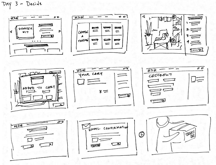
This solution gives the customer a broad picture of each theme using the kit’s items, allowing them to view multiple styles at once. Once they choose a specific theme, they are taken to another page to view a larger image of the overall design and read more about the items included in the starter kit.
![Group 60.png](https://static.wixstatic.com/media/a8c4ba_5d633a26f9374bc0888a9a6e0fc0414d~mv2.png/v1/fill/w_442,h_100,al_c,q_85,usm_0.66_1.00_0.01,enc_avif,quality_auto/Group%2060.png)
![Group 74.png](https://static.wixstatic.com/media/a8c4ba_9379154f49ad4ae7a9a57692af5f88f0~mv2.png/v1/fill/w_1339,h_68,al_c,q_85,usm_0.66_1.00_0.01,enc_avif,quality_auto/Group%2074.png)
![Group 79.png](https://static.wixstatic.com/media/a8c4ba_99a4203a7a474ae0be0b8ce7c2568318~mv2.png/v1/fill/w_309,h_82,al_c,q_85,usm_0.66_1.00_0.01,enc_avif,quality_auto/Group%2079.png)
![Group 74.png](https://static.wixstatic.com/media/a8c4ba_9379154f49ad4ae7a9a57692af5f88f0~mv2.png/v1/fill/w_1339,h_68,al_c,q_85,usm_0.66_1.00_0.01,enc_avif,quality_auto/Group%2074.png)
![Group 80.png](https://static.wixstatic.com/media/a8c4ba_311687e193714c229107673113352c9c~mv2.png/v1/fill/w_247,h_82,al_c,q_85,usm_0.66_1.00_0.01,enc_avif,quality_auto/Group%2080.png)
I interviewed a variety of people for this sprint about online shopping, particularly about what influences their decision to purchase, before moving on to test the prototype.
![Group 72.png](https://static.wixstatic.com/media/a8c4ba_7e0ad7ea2ae0467286d7955d23b67385~mv2.png/v1/fill/w_383,h_228,al_c,q_85,usm_0.66_1.00_0.01,enc_avif,quality_auto/Group%2072.png)
![Group 73.png](https://static.wixstatic.com/media/a8c4ba_0dff4abf604742a1b9acc5f97ae8c6e4~mv2.png/v1/fill/w_390,h_228,al_c,q_85,usm_0.66_1.00_0.01,enc_avif,quality_auto/Group%2073.png)
![Group 71.png](https://static.wixstatic.com/media/a8c4ba_a9809b733ad84ed8bf2f2741a960ce68~mv2.png/v1/fill/w_785,h_453,al_c,q_85,usm_0.66_1.00_0.01,enc_avif,quality_auto/Group%2071.png)
![Group 62.png](https://static.wixstatic.com/media/a8c4ba_65b8de98ecd847fe8e5c27a3086f5ded~mv2.png/v1/fill/w_442,h_100,al_c,q_85,usm_0.66_1.00_0.01,enc_avif,quality_auto/Group%2062.png)
You can view the final prototype here
Final Thoughts
With the focus on speed, it was a bit hard to just stop designing, when there were other pages that I wanted to add or portions I would have liked to expand upon. Since I had limited time, I spent more time on the the first three pages, but neglected the checkout process. In the future, there’s a few things I’d like to do:
-
Do a round of testing for the updated prototype
-
Improve the designs for the second half of the user flow (My Cart, Checkout, Confirmation Page)
-
Add more features on the product page (Reviews, Zoomed Image Overlay)
![Group 63.png](https://static.wixstatic.com/media/a8c4ba_1bf44b088da2497390ea83da9c4fa1c8~mv2.png/v1/fill/w_794,h_240,al_c,q_85,usm_0.66_1.00_0.01,enc_avif,quality_auto/Group%2063.png)